Youth Behaviour Risk Project
Youth Risk Behavior Surveillance
Every two years, the Centers for Disease Control and Prevention conduct the Youth Risk Behavior Surveillance System (YRBSS) survey, where it takes data from high schoolers (9th through 12th grade), to analyze health patterns. We will work with a selected group of variables from a random sample of observations during one of the years the YRBSS was conducted.
We mainly compare the weight of youth and check if that correlates with fitness and test if our assumptions are true. We found that: while one would believe that people who exercise more, weight less, this can not be clearly seen from the graphs. One potential reason might be that muscles actually weight more so that “fitter” people weight more than just skinny people.
Load the data
This data is part of the openintro textbook and we can load and inspect it. There are observations on 13 different variables, some categorical and some numerical. The meaning of each variable can be found by bringing up the help file:
?yrbss
data(yrbss)
glimpse(yrbss)
## Rows: 13,583
## Columns: 13
## $ age <int> 14, 14, 15, 15, 15, 15, 15, 14, 15, 15, 15, 1~
## $ gender <chr> "female", "female", "female", "female", "fema~
## $ grade <chr> "9", "9", "9", "9", "9", "9", "9", "9", "9", ~
## $ hispanic <chr> "not", "not", "hispanic", "not", "not", "not"~
## $ race <chr> "Black or African American", "Black or Africa~
## $ height <dbl> NA, NA, 1.73, 1.60, 1.50, 1.57, 1.65, 1.88, 1~
## $ weight <dbl> NA, NA, 84.4, 55.8, 46.7, 67.1, 131.5, 71.2, ~
## $ helmet_12m <chr> "never", "never", "never", "never", "did not ~
## $ text_while_driving_30d <chr> "0", NA, "30", "0", "did not drive", "did not~
## $ physically_active_7d <int> 4, 2, 7, 0, 2, 1, 4, 4, 5, 0, 0, 0, 4, 7, 7, ~
## $ hours_tv_per_school_day <chr> "5+", "5+", "5+", "2", "3", "5+", "5+", "5+",~
## $ strength_training_7d <int> 0, 0, 0, 0, 1, 0, 2, 0, 3, 0, 3, 0, 0, 7, 7, ~
## $ school_night_hours_sleep <chr> "8", "6", "<5", "6", "9", "8", "9", "6", "<5"~skim(yrbss)| Name | yrbss |
| Number of rows | 13583 |
| Number of columns | 13 |
| _______________________ | |
| Column type frequency: | |
| character | 8 |
| numeric | 5 |
| ________________________ | |
| Group variables | None |
Variable type: character
| skim_variable | n_missing | complete_rate | min | max | empty | n_unique | whitespace |
|---|---|---|---|---|---|---|---|
| gender | 12 | 1.00 | 4 | 6 | 0 | 2 | 0 |
| grade | 79 | 0.99 | 1 | 5 | 0 | 5 | 0 |
| hispanic | 231 | 0.98 | 3 | 8 | 0 | 2 | 0 |
| race | 2805 | 0.79 | 5 | 41 | 0 | 5 | 0 |
| helmet_12m | 311 | 0.98 | 5 | 12 | 0 | 6 | 0 |
| text_while_driving_30d | 918 | 0.93 | 1 | 13 | 0 | 8 | 0 |
| hours_tv_per_school_day | 338 | 0.98 | 1 | 12 | 0 | 7 | 0 |
| school_night_hours_sleep | 1248 | 0.91 | 1 | 3 | 0 | 7 | 0 |
Variable type: numeric
| skim_variable | n_missing | complete_rate | mean | sd | p0 | p25 | p50 | p75 | p100 | hist |
|---|---|---|---|---|---|---|---|---|---|---|
| age | 77 | 0.99 | 16.16 | 1.26 | 12.00 | 15.0 | 16.00 | 17.00 | 18.00 | ▁▂▅▅▇ |
| height | 1004 | 0.93 | 1.69 | 0.10 | 1.27 | 1.6 | 1.68 | 1.78 | 2.11 | ▁▅▇▃▁ |
| weight | 1004 | 0.93 | 67.91 | 16.90 | 29.94 | 56.2 | 64.41 | 76.20 | 180.99 | ▆▇▂▁▁ |
| physically_active_7d | 273 | 0.98 | 3.90 | 2.56 | 0.00 | 2.0 | 4.00 | 7.00 | 7.00 | ▆▂▅▃▇ |
| strength_training_7d | 1176 | 0.91 | 2.95 | 2.58 | 0.00 | 0.0 | 3.00 | 5.00 | 7.00 | ▇▂▅▂▅ |
Before we carry on with our analysis, it’s is always a good idea to check with skimr::skim() to get a feel for missing values, summary statistics of numerical variables, and a very rough histogram.
Exploratory Data Analysis
We will first start with analyzing the weight of participants in kilograms. Using visualization and summary statistics, describe the distribution of weights.
The distribution of weights appears to be skewed right and 1004 observations are missing.
mosaic::favstats(~weight, data=yrbss)## min Q1 median Q3 max mean sd n missing
## 29.9 56.2 64.4 76.2 181 67.9 16.9 12579 1004ggplot(data=yrbss, aes(weight)) +
geom_density() +
theme_minimal() +
labs(
title = "Density plot of weight in kg",
x = "Weight",
y = "Density")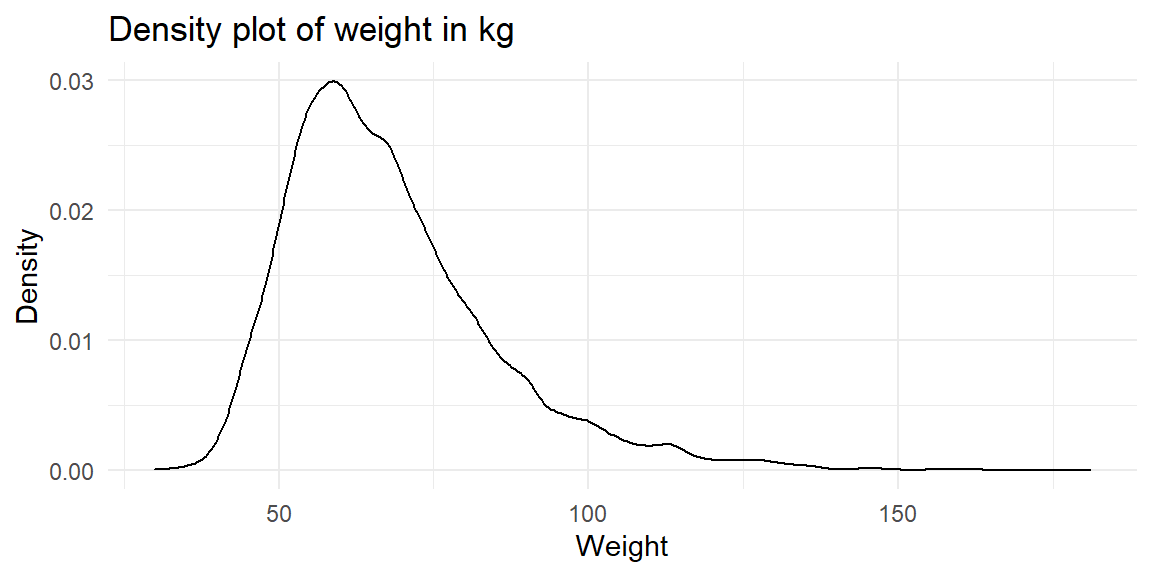
Next, consider the possible relationship between a high scholer’s weight and their physical activity. Plotting the data is a useful first step because it helps us quickly visualize trends, identify strong associations, and develop research questions.
yrbss %>% filter(!is.na(weight), !is.na(physically_active_7d)) %>%

ggplot(aes(x=physically_active_7d, y=weight)) +
  geom_boxplot() +
  facet_wrap(~physically_active_7d, scales="free")+
  theme_minimal()+
   labs(
    title = "Boxplot of weight depending on physical active 7 days",
    x = "Physical active 7 days",
    y = "Weight")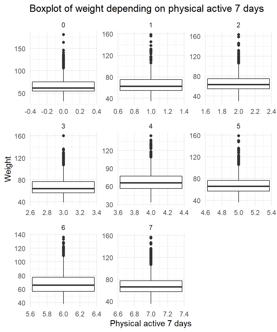
yrbss %>% filter(!is.na(weight), !is.na(physically_active_7d)) %>%

ggplot(aes(x=weight, group=physically_active_7d, color= physically_active_7d)) +
  geom_density() +
  theme_minimal()+
   labs(
    title = "Density plot of weight depending on physical active 7 days",
    x = "Weight",
    y = "Density")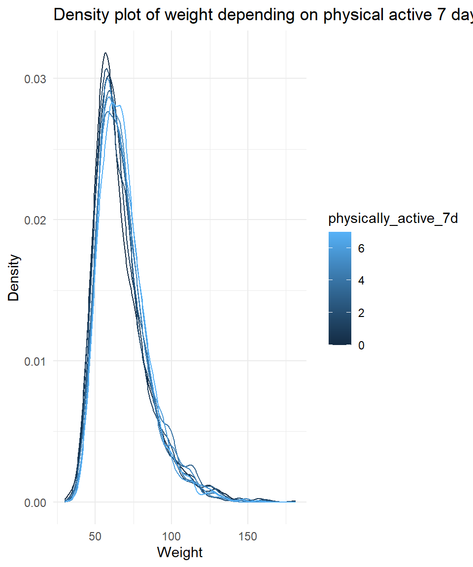
Let’s create a new variable in the dataframe yrbss, called physical_3plus , which will be yes if they are physically active for at least 3 days a week, and no otherwise. We may also want to calculate the number and % of those who are and are not active for more than 3 days. RUse the count() function and see if we get the same results as group_by()... summarise()
yrbss  <- yrbss %>% mutate(physical_3plus=case_when(physically_active_7d>2 ~ "yes",
                                          physically_active_7d<3 ~"no" ))


yrbss %>% filter(!is.na(physical_3plus)) %>%
  group_by(physical_3plus) %>%
  summarise(count=n()) %>%
  mutate(percentage=count/sum(count)*100)
## # A tibble: 2 x 3
## physical_3plus count percentage
## <chr> <int> <dbl>
## 1 no 4404 33.1
## 2 yes 8906 66.9We can provide a 95% confidence interval for the population proportion of high schools that are NOT active 3 or more days per week
n_target <- yrbss %>% filter(grade == 10, physically_active_7d < 3) %>%
  count()
n <- yrbss %>% count()
p <- n_target / n
se <- sqrt(p * (1 - p) / n)
lower = p - 1.96 * se
upper = p + 1.96 * se
lower
## n
## 1 0.0641upper## n
## 1 0.0726While one would believe that people who exercise more, weight less, this can not be clearly seen from the graphs. One potential reason might be that muscles actually weight more so that “fitter” people weight more than just skinny people.
yrbss %>%
  filter(!is.na(physical_3plus)) %>%
  ggplot(aes(x=physical_3plus, y=weight)) +
  geom_boxplot() +
  labs(
    title = "Boxplot of weight depending on physical active 3+ days",
    x = "Physical active 3+ days",
    y = "Weight")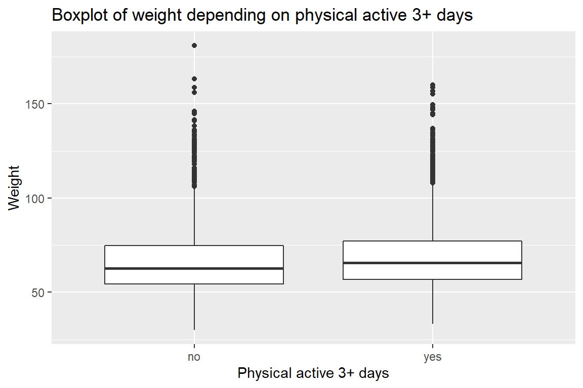
Confidence Interval
Boxplots show how the medians of the two distributions compare, but we can also compare the means of the distributions using either a confidence interval or a hypothesis test. Note that when we calculate the mean, SD, etc. weight in these groups using the mean function, we must ignore any missing values by setting the na.rm = TRUE.
yrbss %>%
  filter(!is.na(physical_3plus)) %>%
  mutate(physical_active_numeric = case_when(
  physical_3plus  == "yes" ~ 1,
  physical_3plus  == "no" ~ 0 )) %>%

  summarise(mean=mean(physical_active_numeric),
            sd=sd(physical_active_numeric),
            count=n(),
            se = sd/sqrt(count),
            t_critical=qt(0.975, count - 1 ),
            lower = mean-t_critical*se,
            upper = mean+t_critical*se)
## # A tibble: 1 x 7
## mean sd count se t_critical lower upper
## <dbl> <dbl> <int> <dbl> <dbl> <dbl> <dbl>
## 1 0.669 0.471 13310 0.00408 1.96 0.661 0.677There is an observed difference of about 1.77kg (68.44 - 66.67), and we notice that the two confidence intervals do not overlap. It seems that the difference is at least 95% statistically significant. Let us also conduct a hypothesis test.
Hypothesis test with formula
Write the null and alternative hypotheses for testing whether mean weights are different for those who exercise at least times a week and those who don’t.
difference = mean(weight of people who exercise 3+) + mean(weight of people who excercise less than 3) H0: difference = 0 H1: difference != 0
t.test(weight ~ physical_3plus, data = yrbss)##
## Welch Two Sample t-test
##
## data: weight by physical_3plus
## t = -5, df = 7479, p-value = 9e-08
## alternative hypothesis: true difference in means between group no and group yes is not equal to 0
## 95 percent confidence interval:
## -2.42 -1.12
## sample estimates:
## mean in group no mean in group yes
## 66.7 68.4Hypothesis test with infer
Next, we will introduce a new function, hypothesize, that falls into the infer workflow. We will use this method for conducting hypothesis tests.
But first, we need to initialize the test, which we will save as obs_diff.
obs_diff <- yrbss %>%
  specify(weight ~ physical_3plus) %>%
  calculate(stat = "diff in means", order = c("yes", "no"))
Notice how we can use the functions specify and calculate again like we did for calculating confidence intervals. Here, though, the statistic we are searching for is the difference in means, with the order being yes - no != 0.
After We have initialized the test, we need to simulate the test on the null distribution, which we will save as null.
null_dist <- yrbss %>%
  # specify variables
  specify(weight ~ physical_3plus) %>%

  # assume independence, i.e, there is no difference
  hypothesize(null = "independence") %>%

  # generate 1000 reps, of type "permute"
  generate(reps = 1000, type = "permute") %>%

  # calculate statistic of difference, namely "diff in means"
  calculate(stat = "diff in means", order = c("yes", "no"))
Here, hypothesize is used to set the null hypothesis as a test for independence, i.e., that there is no difference between the two population means. In one sample cases, the null argument can be set to point to test a hypothesis relative to a point estimate.
Also, note that the type argument within generate is set to permute, which is the argument when generating a null distribution for a hypothesis test.
We can visualize this null distribution with the following code:
ggplot(data = null_dist, aes(x = stat)) +
  geom_histogram() +
  theme_minimal()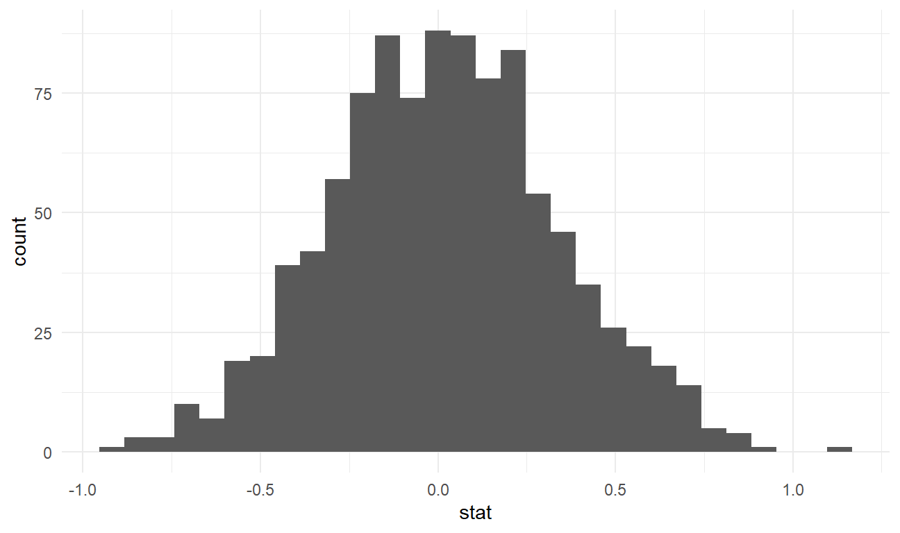
Now that the test is initialized and the null distribution formed, we can visualise to see how many of these null permutations have a difference of at least obs_stat of 1.77?
We can also calculate the p-value for the hypothesis test using the function infer::get_p_value().
null_dist %>% visualize() +
  shade_p_value(obs_stat = obs_diff, direction = "two-sided")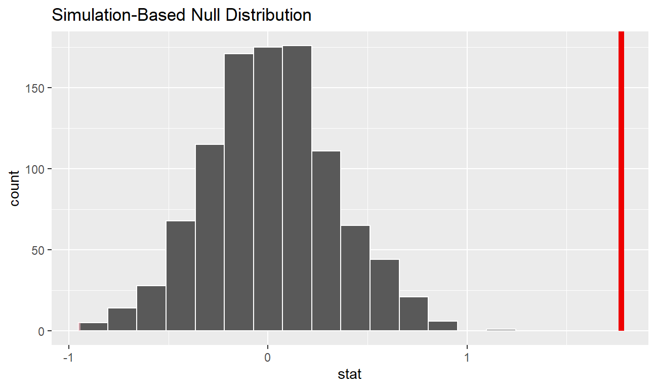
null_dist %>%
  get_p_value(obs_stat = obs_diff, direction = "two_sided")
## # A tibble: 1 x 1
## p_value
## <dbl>
## 1 0